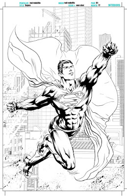
 The main objective when composing a visual story is to guide the reader through the panels of each page in a clear and effective manner. For you to get your message across, however, you must be able to understand the eight elements of composition and how to make them all work together as intended.
What now follows is a brief explanation about those eight elements of composition:
1) Emphasis or Focus: To understand this stage of the process you must ask yourself a series of questions. These include: What’s the most important artistic element within the picture you’re trying to produce? What’s the message behind it? And what’s the story you’re trying to tell?
2) Rhythm: Although most people think of rhythm in musical terms, where the visual arts are concerned, try to take this as meaning how each of the element's within your image are placed in the space provided, and how they relate to each other in terms of size, place, and frequency.
 3) Proportion or Variety: Designs, shapes, and any other brand of visual element, normally help to establish a dynamic action in relation to where they’re physically situated as well as in what proximity they are to each other.
4) Contrast or Economy vs Complexity: Or in other words, what you draw is almost as important as what you don’t!
5) Repetition or Pattern: A large majority of patterns are usually composed of repeatable shapes or textures so the end result is a well defined underlying structure.
6) Balance or Imbalance: The visual balance of elements within your image will make it clear what it’s main focus actually is (i.e. it’s message, it’s meaning, it’s intent).
7) Continuity or Movement: Continuous lines are usually used to suggest the illusion of movement and simulate motion within a static image.
8) Unity: This is the final step in developing a picture where each individual element comes together with the intent of making one solid and cohesive whole: Similar to a human being who’s comprised of different body parts.
The main purpose of composition is to tell a story in the way you want to tell it. Now with the use of good composition you can make the overall narrative a lot easier to follow, whereas with the use of bad composition, the opposite is also true and you can make things that much harder. In order to do this, however, you first have to figure out what it’s main driving force is going to be!
Usually, good composition will guide the reader's eyes through your artwork, one panel at a time, so they know exactly where to look and why they should be looking there. Sometimes this can be a bit confusing though, because how can you transmit your story, your tone, and your intent, while overemphasizing the message behind it?
I tell you what: Let’s start with a "simple example", shall we? Doing so by analyzing a persons face. Most notably, Superman’s face, who in my opinion is a very difficult hero to draw because his face needs to represent integrity, justice, dignity, and truth, which are considerably harder to illustrate due to these character traits being less apparent than someone like Batman’s, for instance, who projects a bold shrouded image of mystery, dedication, and suspense.
Seriously, how can we make these subtle, intangible concepts, into a more solid and tangible one? That’s why Superman is so hard to draw; because his face is normally unobstructed with these emotionally enhanced components, components we have to put in place and make as natural as possible. So do you see what I’m trying to say, dear reader? I hope so, because if you can understand how to apply this artistic technique, great, the hardest part is finally behind you, and in my eyes, yes, the most rewarding part!
NEXT: The Drawing Process!
This article was brought to you by Brazilian born, Rod Rodollfo from Alpha Brain Art Studio. Please feel free to download the Master Page Template used by Rod on many Published Comic Books by clicking here! And while you're at it, don't forget to follow him on his website, twitter, and facebook pages.
THE ARTIST'S JOURNEY - LESSON EIGHT: THE 8 ELEMENTS OF COMPOSITION
 Reviewed by David Andrews
on
May 07, 2018
Rating:
 Reviewed by David Andrews
on
May 07, 2018
Rating:


No comments: